Well friends, here we are onto the reason I started the Rabbit Hole blog.
As I work on recreating a particularly beautiful Elizabethan embroidered book cover (British library shelf mark C17a23) for Pentathlon, I have fallen head first into an unexpectedly nuanced problem. Thread color. I’ve come to realize that being a painter has made me spoiled by an infinite palette. Even when I’ve worked things like chalk and colored pencil, I’ve had such an enormous amount of options. I keep a 120 pencil set of Faber Castell Polychromos and they can be layered to create additional colors. My chalk of choice is Stabilo Carb-Othello chalk pencils, which also has an impressively broad color selection.
Enter this foray into embroidery. At the beginning of this project, a firm line was drawn in the sand by my Laurel; I was forbidden from dyeing my own silk. This after someone had suggested it was a good way to get bonus complexity points. So I got a second suggestion for making it more difficult AND more period: I could work with flat silk.
So off I went to buy silk and I found the first problem: There are not that many sources for flat silk. Below the sources are listed in order:
- Pipers Silks from England: This is where my first silk came from. I do not recommend them. The silks I received where so off color from their website; think purple spools that came brown. Their customer service is terrible; unresponsive and unhelpful. More than that though, the silk is very thin, closer to thread than embroidery floss. It has less shine than the other silks in my collection. I have still ultimately ended up using some of it in this piece, but unhappily.
- The French company Au Ver à Soie discontinued Soie Platte line, which was flat silk. Their Soie Ovale line is technically lightly thrown and has to be untwisted into 6 separate flat silk strands. Soie Ovale is great though, once you untwist it. The colors are vibrant and lovely, but there’s ultimately a fairly limited color palette. From what I can tell their color catalogue goes through frequent changes with older colors being discontinued and new colors being added. If you love a color: buy a lot. It may not be available next year. The best place to buy Soie Ovale in the states is Threadneedle Street in Issaquah, WA. The owner is super friendly to historical recreationists.
- JEC (Japanese Embroidery Center): JEC has a huge catalogue. It’s hard to navigate and they know it. You can solve that if you want by buying a $60 sample kit. Note: I didn’t. Compared to the other options these spools come with alot of silks and they are phsyically twice the size of the pipers spools. That being said, they’re also nearly four times the price of the Soie Ovale. To my eye, all of the silk’s I received from JEC have a silver cast/shine. The silk is incredibly delicate and catches/snares easily so you’ll need to be careful with it.
- Suzhou Embroidery Arts & Crafts Shop on Etsy was my very last find and saved my ass to some extent. Like the Soie Ovale, the silk is lightly thrown, but is only two strands in the twist. It’s so thick and lovely that in some places, I haven’t even doubled it up on the needle. She doesn’t sell single spools. Everything is sold in dye strength collections. Very light blush pink all the way to burgundy for instance. None of them are overdyed, so in that way the palette. Still this floss is a huge find and the quality is really nice. It’s also only $1 a spool.
Note: She quotes a super long lead time (up to 60 days), but ultimately my silk has three times now shipped the next day and arrived within 3 weeks. This last time it came in only ten days.
I largely avoided JEC because of the cost, but overall I now own more than 150 spools of embroidery floss, all in an attempt to get the right colors for an embroidery piece with less than 30 colors in it. Yes, you did read that correctly. So without further ado: let’s go over the first seven colors.
This embroiderer was so rich in thread. I marveled over how many colors are in the leaves and flowers. I’ve ultimately decided that there are 12 distinct colors between the yellows, greens and blues. I’ll have to use another blog post or two for the remaining colors. This is going to be long enough.
I for my part, knew nothing about dye at the start of this and I’m far from an expert. In fact, I didn’t even know overdyeing was a thing until I found Drea Leed’s Lyntell Dye Boke project, specifically a page on indigo vat variations. After talking with the amazing Ercil, I had a better understanding of how many of the colors those two dyes could be responsible for. Answer: most of them. It didn’t quite account for everything I was seeing and so: a very painful process began.
For simplicity, let’s assign a mathematical values to this. These numbers are in no way meant to imply that the dye process is linear in either time or dye strength, but is rather representative of resulting strength of colors:
Yellows: Weld light, medium and heavy = W1, W2, W3.
Blues: Indigo light (1), medium (2) and heavy (3) = I1, I2, I3. Woad medium and heavy = WD1, WD2
And huge range of colors in between:
There is one indigo gradient: light indigo (I1) | medium indigo (I2) | dark indigo (I3)
There is one teal gradient: light teal (W1+I1=T1) | medium teal (W1+I2=T2) | dark teal (W1+I3=T3)
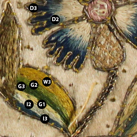
There is one gold-green gradient: gold (W3)| bright green (W3+I2=G2)| dark green (W3+I3=G3)
There is one green gold solo color: green gold (W2+I1=G1)
There is a two step blue gradient: medium blue (D2), (D3)
Why do I think there’s woad in the mix? Well for starters, those D2/D3 blues are noticeably bluer (you can see it in figure 3). But also: woad has a greater overall fastness. While indigo and woad have comparable light fastness, indigo is more prone to wear from handling. This is particularly relevant when we’re talking about functional items: like a book.
In modern textiles they call this the rub rating. Industrial textiles undergo rigorous tests to ensure that textiles in places like hospitals hold up to the fact that people interact with them hundreds of times a day. The lighter indigo blues (I1 and I2) show heavy wear, with I1 faded away to nothing (figure 1), even though there is an intact medium blue on the flower (figure 3). That doesn’t mean that the better preserved blues are straight indigo. Woad balls were sometimes added to indigo baths. Without some seriously industrial equipment, I can’t really accurately speak to how much woad would be needed to stabilize it against wear from handling.
If what I think is straight indigo, was instead a combination of weld and the bluer blue from the blue flower (figure 3), when the indigo faded away, the weld would remain. Weld has incredible fastness and shows no signs of fade in any of the places it’s used elsewhere on the piece. The fact that it faded to nothing, instead of fading to yellow, shows me that it’s indigo. If the I1, I2 and I3 colors are just indigo, the better preserved blue has to be either something else entirely, or a combination that includes something else.
To buy most correct colors I could, I ultimately did some comparison against the collections created by Tricia Nguyen. She had the pleasure of viewing the back of a number of Elizabethan stumpwork embroidery pieces and created Au ver à Soie collections by matching colors to what she had seen. I was hoping to interview her and offered to pay her for her time. No response so I’ve worked with what’s public on her website.
From Tricia’s lists I pulled the Indigos (I1, I2, I3), the gold, green gold, and dark green (G3). I used the Chinese silks for the teals and woad-influenced blues. I used Pipers for the bright green.
- Light Indigo: Soie Ovale 0072
- Medium Indigo: Soie Ovale 277
- Dark Indigo: Soie Ovale 703
- Gold: Soie Ovale 2533
- Bright Green: Pipers Leaf
(Edit: I have switched to Soie Ovale 2124. It has slightly better contrast and is easier to work with.) - Dark Green: Soie Ovale 5025
- Light Teal: Chinese silk 50-7
- Medium Teal: Chinese silk 50-2
- Dark Teal: Chinese silk 50-4
- Green Gold: Soie Ovale 2212
- Dark Blue: Chinese silk118-6
- Medium Blue: Chinese silk 118-3
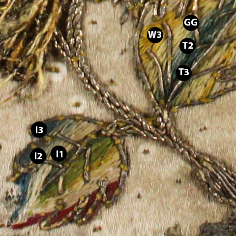
Figure 1
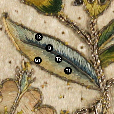
Figure 2
Recent Comments